Legal CRM Platform
A CRM platform for a legal firm, specializing in landlord-tenant law, with a focus on eviction services and property management legal support.
 Figma
Figma Miro
Miro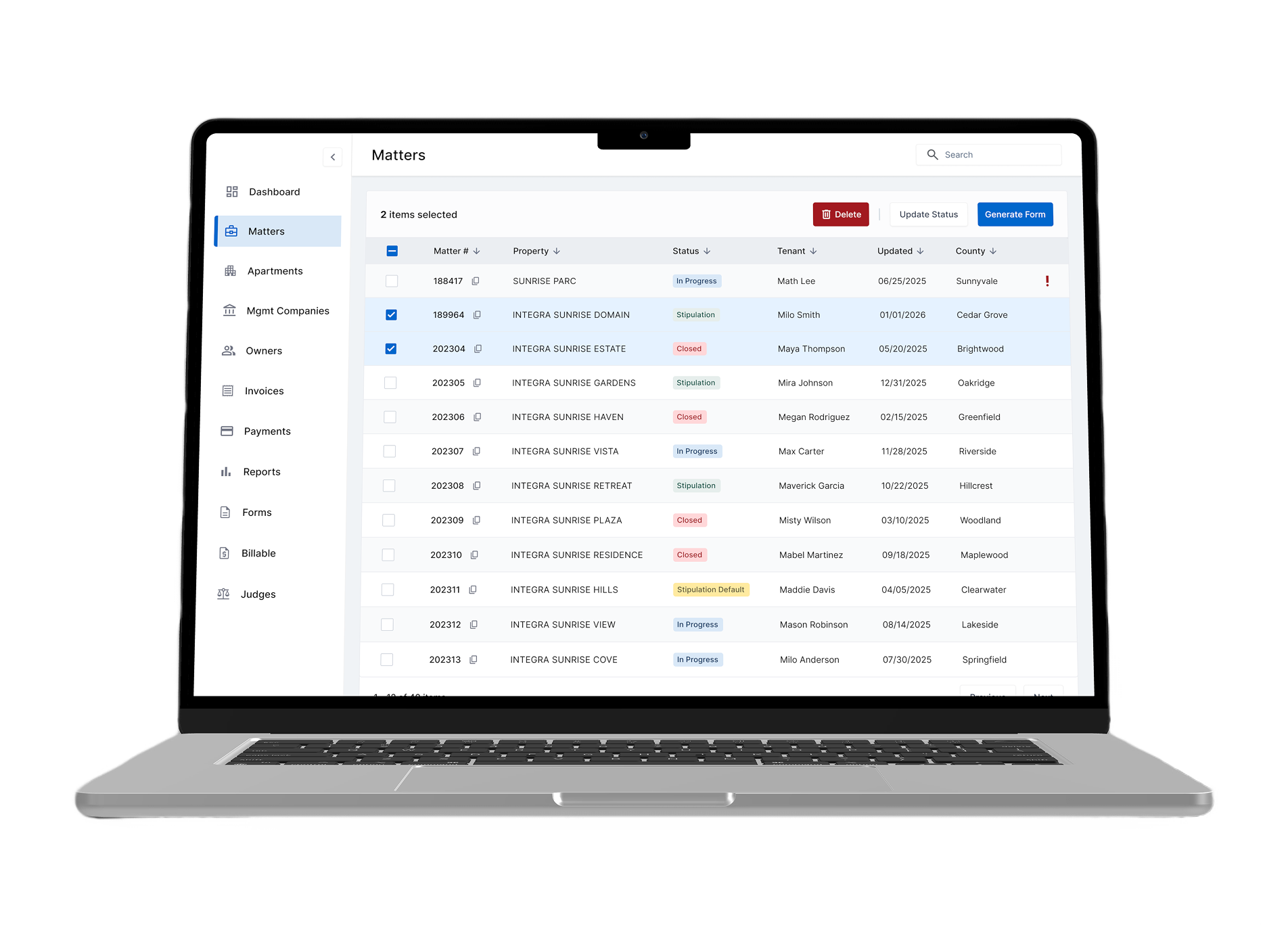
Challenge
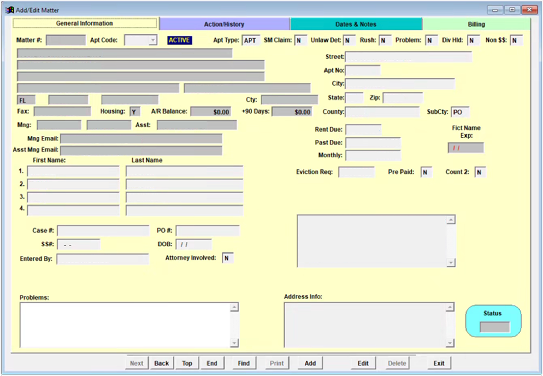
The law firm's old system was noticeably slow, every click and form field took extra time to respond. Users had to jump between multiple screens just to complete routine tasks, which frustrated staff and led to delays, errors, and a slower matter intake process. On top of that, the interface made it hard to manage complex legal data across multiple pages.
Goal
Conceptualize, design and prototype a new user flow that would improve usability, reduce data entry errors and simplify the matter intake process.
Discovery & Research
Stakeholder Workshops
We held several workshops with all key stakeholders. Our goal was to agree in advance on business objectives, technical constraints and what success would look like. This helped us identify hidden dependencies and expectations.
User Interviews & Observation
I then spent time directly with the users who is using the system every day. To do this, I conducted 1:1 interviews in which I observed how users used the system, what challenges they faced, and what they would like to improve. I paid close attention to the workarounds they created themselves, which often revealed deeper gaps.
Ideation & Sketching
"Crazy Eights" technique helped me to generate a variety of ideas for how the new matter flow could look like. I sketched possible layouts for a single, unified "Matter Overview" page and brainstormed with the team ways to bring frequent actions (like adding new matter, preview it etc.) directly into the workflow. Afterward, I used affinity mapping to cluster the best ideas, spotting common patterns like the need for collapsible sections and easily accessible inline actions.
Design Process
Low - Mid Fidelity Wireframes
At this stage, I began by drafting low fidelity wireframes to visualize how the new user flow could look like and function. I then created a clickable MVP prototype in Figma, focusing on key interactions and layout structure. To validate the design, I conducted moderated usability sessions with 5 users. These sessions helped measure how easily and quickly users could complete tasks, how often they switched contexts, and allowed me to gather valuable qualitative feedback.
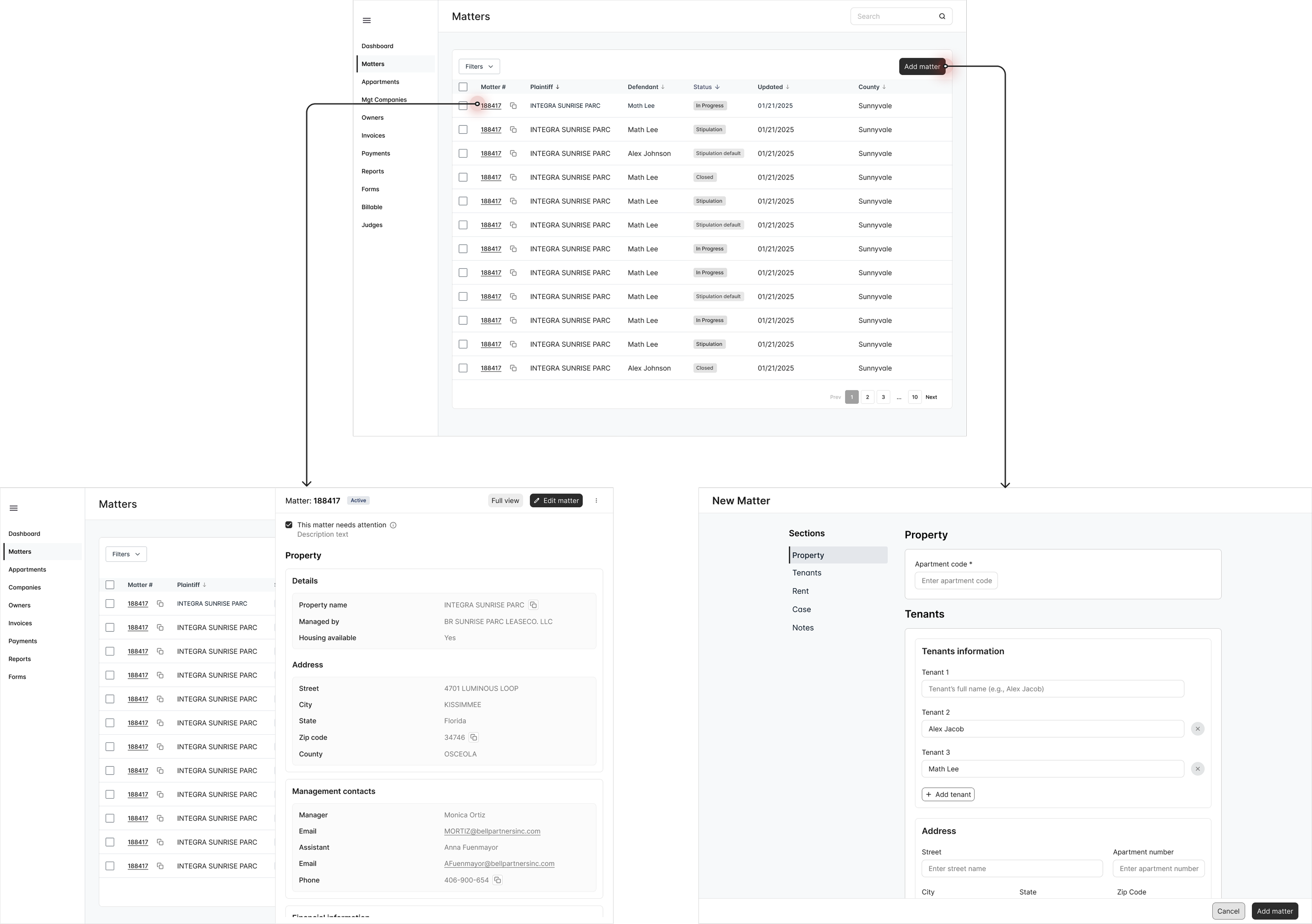
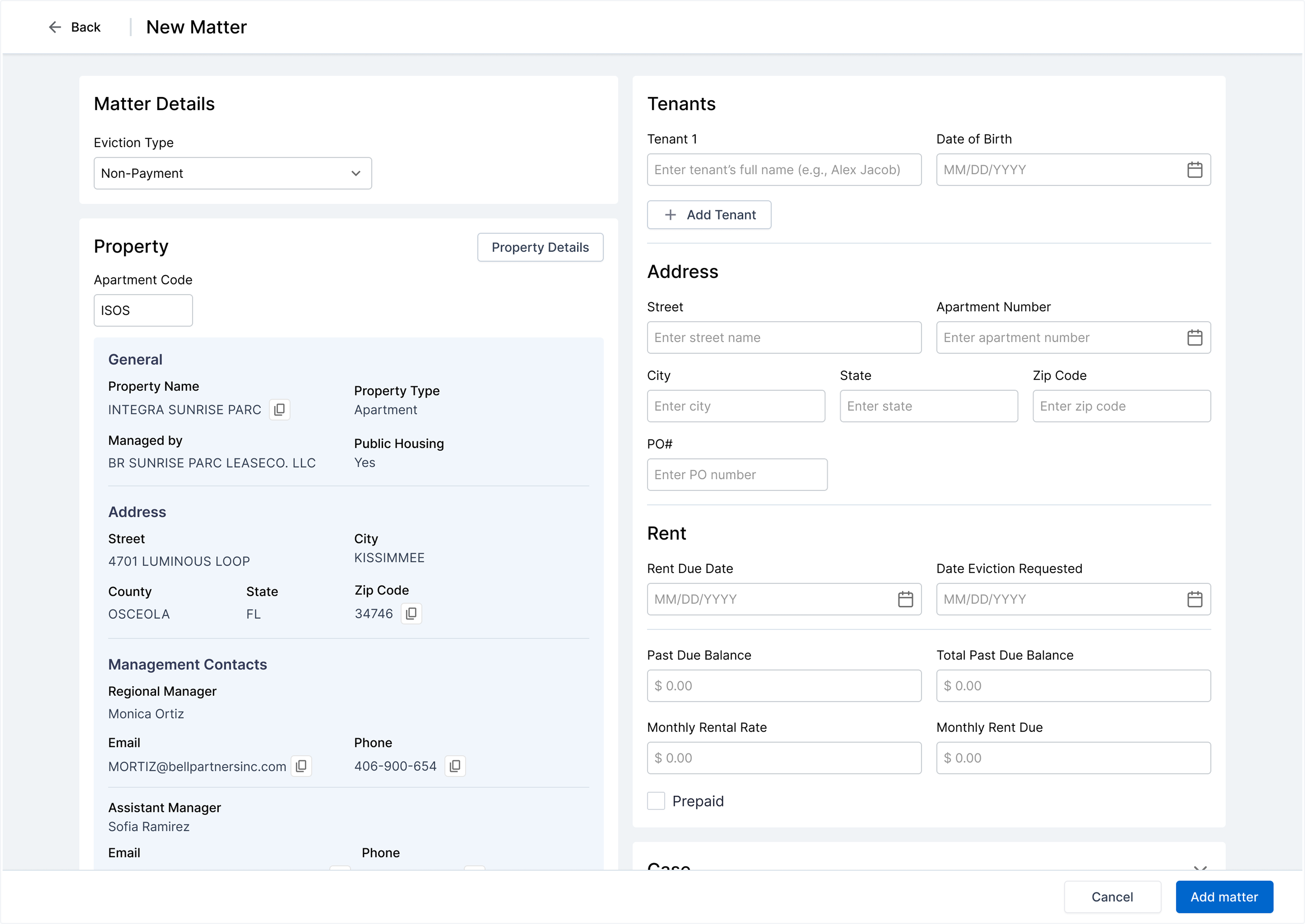
High Fidelity Wireframes
After figuring out how the user flow could work, I proceeded to design high fidelity wireframes.
Usability Testing
I was able to test 5 users remotely. I sent them the prototype link, explained them a scenario:
Scenario
Create a new legal matter entry for a client, upload related documents, and add primary parties.
Tasks
- • Start at the Matter Overview screen.
- • Create a new matter by filling in the required fields (matter name, case type).
- • Upload a document (the signed agreement) using the inline upload action.
- • Add the primary client as a party to the matter.
- • Add the opposing party.
- • Save and review the new matter entry.
User Feedback
"It's nice that everything is in one place."
"The upload button was easy to find."
"Can the required fields be more clearly marked?"
"I didn't notice the 'Add Party' option right away."
Iterations
Based on user feedback, I iterated on the design to address visibility issues with required fields and the 'Add Party' action. I enhanced visual hierarchy, added clearer labels, and improved the discoverability of key actions. These refinements resulted in a more intuitive and efficient user experience.
Results
- • Redesigned user flows simplified critical tasks such as creating matters, uploading documents, and adding parties, resulting in a more intuitive experience.
- • User feedback indicated improvements in task clarity and overall workflow cohesion.