Design System for Learning Management Platform
The learning management system for employee training and customer education, offering tools for course creation, delivery, tracking, and reporting.
 Figma
Figma Miro
Miro Storybook
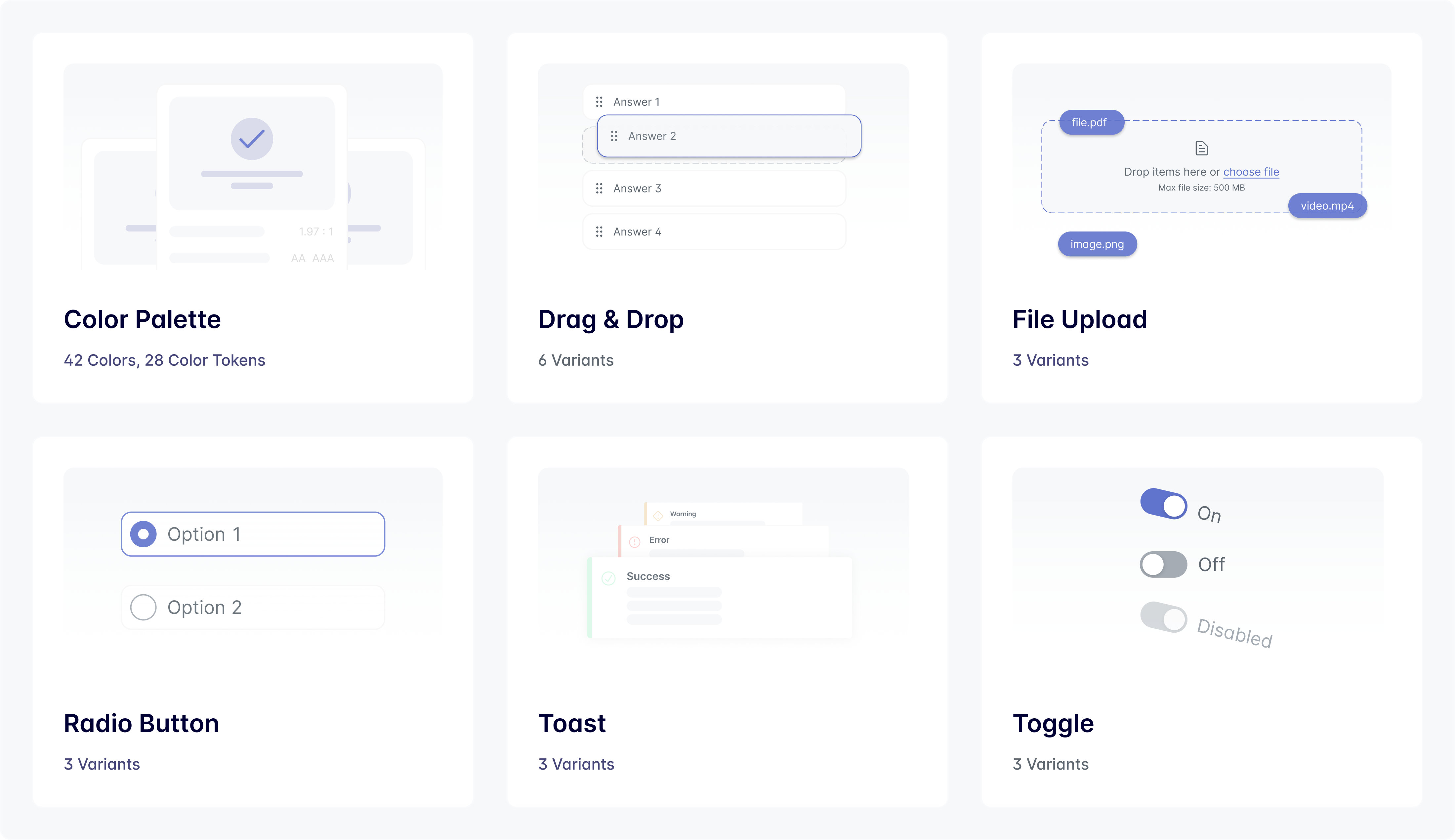
Project Overview
When I joined the company as a Product Designer, the product faced some inconsistency challenges. There was no unified design language, which made the experience feel fragmented and hard to navigate. Without a shared system, design and development often got out of sync, slowing down production and causing frustration on both sides. Key features didn't meet basic standards, making the platform less inclusive. We needed a more solid foundation, a system that could bring clarity, consistency, and scalability to both the product and the teams behind it.
Goal
The primary goal of the Design System initiative was to create a scalable design library that would:
- 01Serve as a single source of truth for design and development teams.
- 02Standardize UI components to improve efficiency and consistency.
- 03Enhance accessibility and elevate the overall user experience.
Scope and Approach
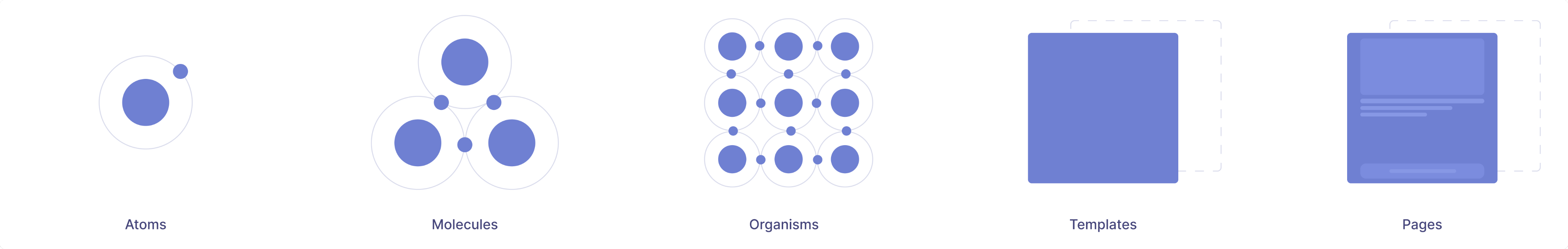
In this project, I applied the Atomic Design methodology, breaking down the interface into atoms, molecules, organisms, templates, and pages. This structured approach enabled us to build complex screens from smaller, reusable components, ensuring scalability, and design consistency.
To address the challenges and support the product's growth, I took a structured, collaborative approach:
1. Audit & Analysis
I began with a comprehensive audit of existing designs and components to identify inconsistencies, usability issues, and areas needing immediate attention.
2. Defining Priorities
Working closely with the Product Design Manager and Front-End Engineers, we aligned on short- and long-term priorities — focusing first on high-impact, frequently used components.
3. System Development
Following Atomic Design principles, I built a flexible, scalable component library, which included:
- Clear naming conventions and an intuitive structure for designers and developers
- A mirrored version in Storybook to ensure alignment across design and development
4. Documentation
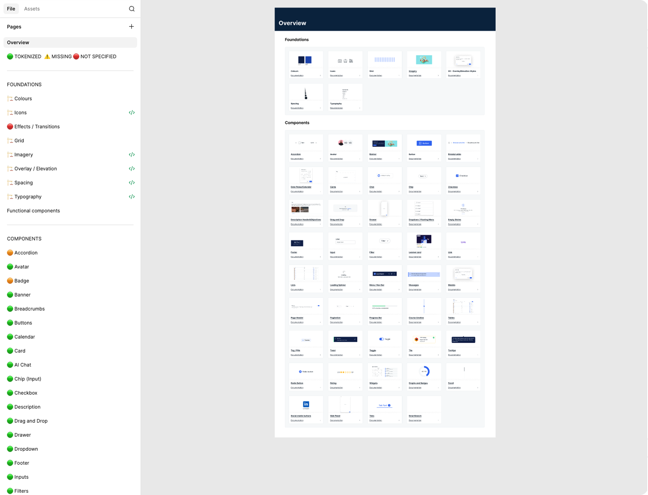
I created thorough documentation outlining usage guidelines, design principles, and best practices to support consistent adoption across teams. To provide visibility on the evolution of the Design System, I created a dashboard as a single source of truth with all components.
5. Continuous Feedback
Regular syncs with cross-functional teams ensured we gathered feedback early and often — allowing the system to evolve with the product's needs.
Challenges
Rapid Scaling Across Projects
With multiple projects in development, the system needed to scale quickly while maintaining quality and flexibility. I tackled this by prioritizing modular, reusable components and adapting as new use cases emerged.
Cross-Team Alignment
Bridging the gap between design and engineering teams required significant effort, as workflows and priorities often differed. Through workshops, collaborative tools, and clear communication, I ensured alignment across teams.
Balancing Responsibilities
One of my biggest challenges was balancing the creation of the Design System with ongoing UX project responsibilities. Limited time and competing priorities required careful planning.
Results
As a result, 44 reusable components were built on a clear foundation of typography, color, and sizing tokens in Figma. To make the design system easy to use day to day, I added a navigation dashboard so designers could quickly find components, styles, and guidance.
Components were built as flexible master components, using auto layout and component properties to cover real product needs without overloading the system with unnecessary variants. This made components easier to adopt, extend, and maintain as the product evolved.
I worked closely with engineering to align on behavior, states, and edge cases before handoff. Components were implemented in Storybook, keeping design and code in sync and reducing back-and-forth during development.
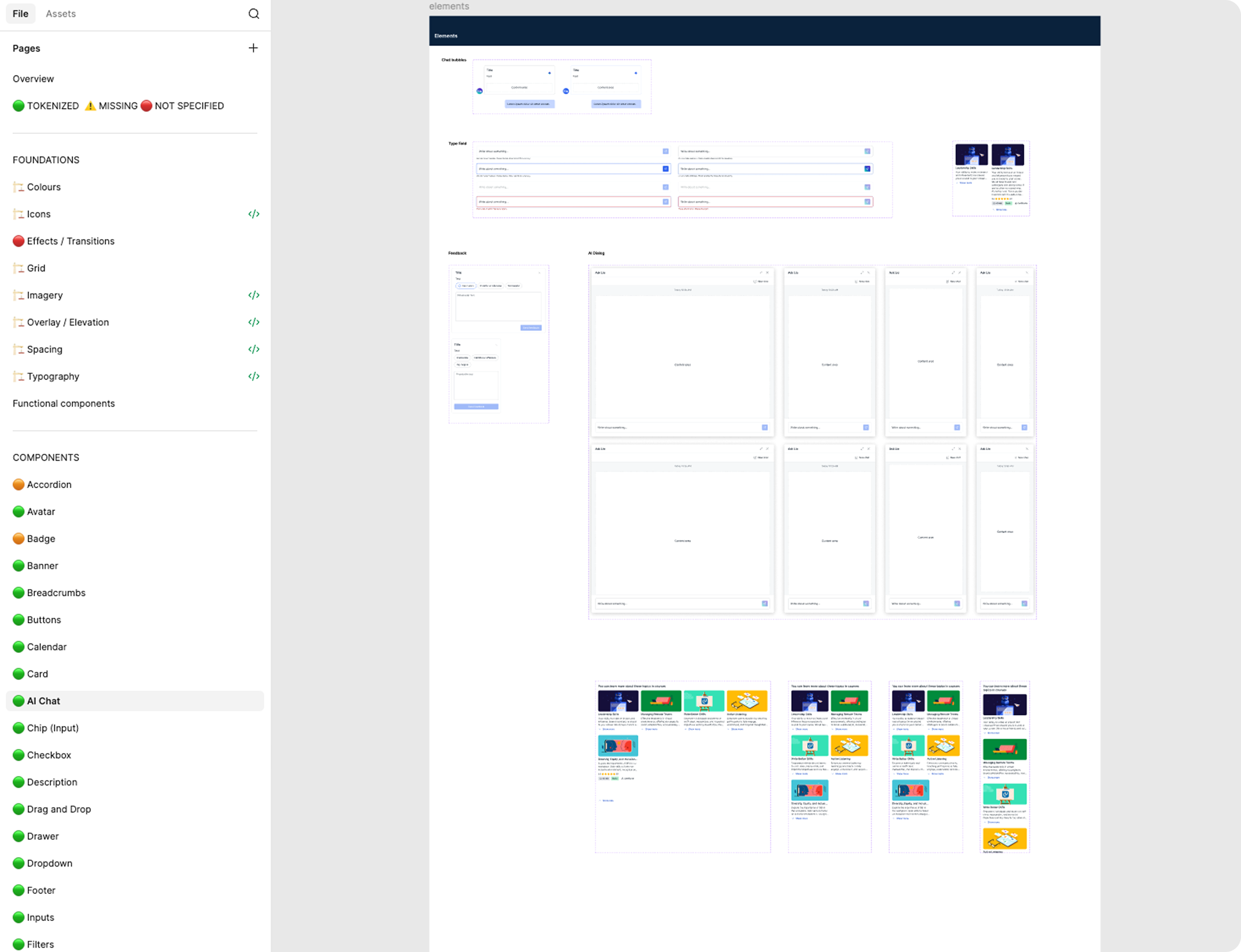
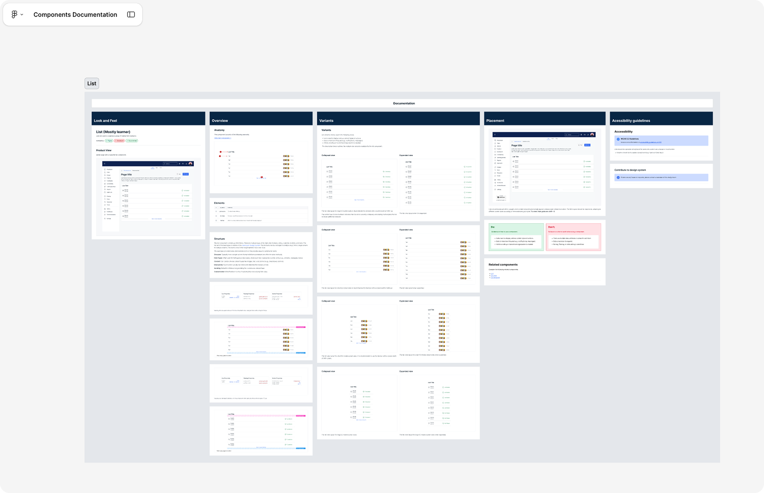
Every component, template, and page was documented in Figma, covering usage, anatomy, variants, placement, and accessibility guidelines.
The design system brought consistency across the product, reduced friction between design and development, and helped teams move faster with fewer visual issues. User testing confirmed the impact, with clearer layouts and visual hierarchy making tasks easier to complete.